svelte-layout-resizable
resizable layout component for svelte
status
:warning: deprecated in favor of
- split - utilities for resizeable split views
- areas - A Vue.js Blender style area manager to create custom layouts
usage
in your App.svelte add
<script>
  import L from 'svelte-layout-resizable';
</script>
<L row>
  <L>cell 1 in row</L>
  <L column>
    <L>cell 2.1 in column</L>
    <L>cell 2.2 in column</L>
    <L>cell 2.3 in column</L>
  </L>
  <L>cell 3 in row</L>
</L>
result:
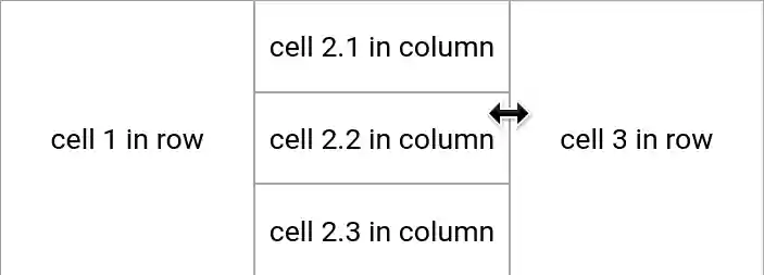
<L row> is a broad container with css flex-direction: row
<L column> is a tall container with css flex-direction: column
if you dont like the <L> syntax
you can do import Layout from 'svelte-layout-resizable';
and use <Layout>cell</Layout>
style
the component defines only a minimal style
to implement containers and resize-handles
most users want to add style to their App.svelte, like
<style>
  /* layout */
  :global(body) {
    /* use full window size */
    padding: 0;
  }
  :global(.layout-cell>.middle>.center) {
    /* content cell: add scrollbars when needed */
    overflow: auto;
  }
  :global(.layout-cell>*>.frame) {
    /* frame color and border */
    /*background-color: #f4f4f4;*/
    border: solid 0.5px #a8a8a8;
  }
  :global(.layout-cell>*, .layout-cell>*>.frame) {
    /* frame size
       larger frames are better acccessible (touchscreen) */
    flex-basis: 2.5px !important;
  }
  /* use css classes on cells like
     <L class="overflow-hidden">....</L> */
  :global(.layout-cell>.middle>.center.overflow-hidden) {
    overflow: hidden !important;
  }
  /* use css classes on containers like
     <L row class="custom-row-container">....</L> */
  :global(.layout-row.custom-row-container) {
    color: orange;
  }
</style>
related
- goldenlayout.js (RIP jQuery)
- svelte-subdivide [v3]
- svelte-grid
- other svelte layout components in sveltesociety → tag: layout and structure
- solidjs-resizable-splitter-component port of this library for the solidjs framework
todo
-
avoid changing body style?
only ‘stop selecting text’ in layout containers? -
fix resize bug with many cells
like a 3x3 layout
in the center container -
fix newStyle.marginLeft and newStyle.marginTop
-
allow to hide/deactivate resize handles
on the outside of a class=”root” container (better: find root container automatically) -
allow resize from corner handles?
-
imitate goldenlayout.js and qt dockable widgets
maybe as a separate node package, keep it small-
allow to drag/move and dock cells to other containers
-
allow to expand one cell over the root layout
-
-
add a tab widget? out of scope?
we already have svelte-tabs -
support ‘live resize’ of layout
con: need more CPU/GPU = debounce to like 10 FPS - beforeUpdate or onMount
calculate sizes of all cells
so when we have<L> <L s="0.6">1</L> <L>2</L> </L>then cell 2 should have size 0.4
and not what css-flex suggests
based on content size
or did we use flex wrong? -
check bounds on resize
eventually shrink more cells - verify overflow on resize
avoid unnecessary scrollbars
license
license is creative commons zero 1.0